I am now going to move onto researching into suitable fonts for childrens books and see why they are used. I have found this very helpful article on Creative Bloq about how to chose fonts for children’s books.
http://www.creativebloq.com/typography/choose-fonts-illustration-7133658 (accessed 2nd May 2016)
There were some very valid points in this article about researching to see whats out there already and why it works, not to just choose a font because you like it because it can completely make or break your illustration and considering how legible it is or if it is needed.
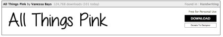
The article said to take a look at LostType.com, and so I did, and found:
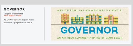
Governor
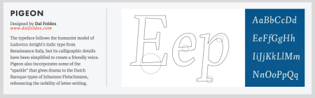
Pigeon
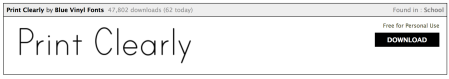
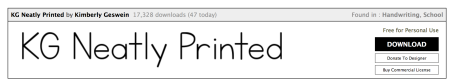
I also looked on 1001freefonts.com to see if they had more of a suitable selection for what I wanted which would work better with my illustrations.
http://www.1001freefonts.com/school-fonts.php (accessed 2nd May 2016)
I found these fonts which are downloadable and are all easy and clear to read.
I also went through Pages and had a look at what fonts were suitable on there, and tested a few out to see how they looked. Of this selection, I think that ‘Chalkboard’, ‘Geneva’ and ‘Optima’ are the most suitable, because ‘Chalkboard’ is how children are taught to write in schools, therefor they would probably find this one the easiest to read out of the 6 because it is the most relatable.
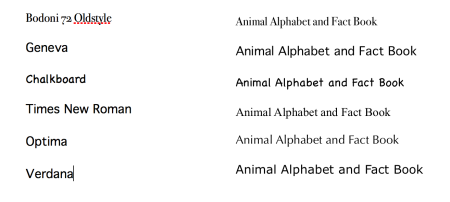
All of these folks would be suitable and easy to read for my audience, but I will need to test out what looks best when it is placed around my illustrations. I am going to experiment with each of these typefaces using the correct facts so that I can see how it looks when it is part of the illustration. I am going to keep the text black because I have read during my research that there are various reasons why the text is black, and the main reasons are because it is the clearest and most recognisable against white paper, and because books are printed in two stages, one stage in colour with no text so that the text can then be added over the top in the chosen languages.
